

Developing my brand started with one of the pillars of design: COLOR. I used 5 of my favorites tried and true Benjamin Moore paint colors to establish my brand’s new identity. All are classic, timeless, with a hint of fun!
KBI’s go to NEUTRAL White Dove (no. OC-17) by Benjamin Moore is a staple I recommend for clients who want a palette that will allow their furnishings and art to be the focal point of the space, see my home.
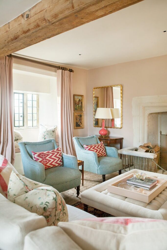
PINK can also be neutral and used outside of your typical bedroom. Pink Bliss (no. 2093-70) by Benjamin Moore provides a soft ease to a home. I would not recommend using it throughout the home, but definitely be used in a formal living room or another common space to add a softness that is so very elegant but not pretentious.
@samanthatodhunterdesign
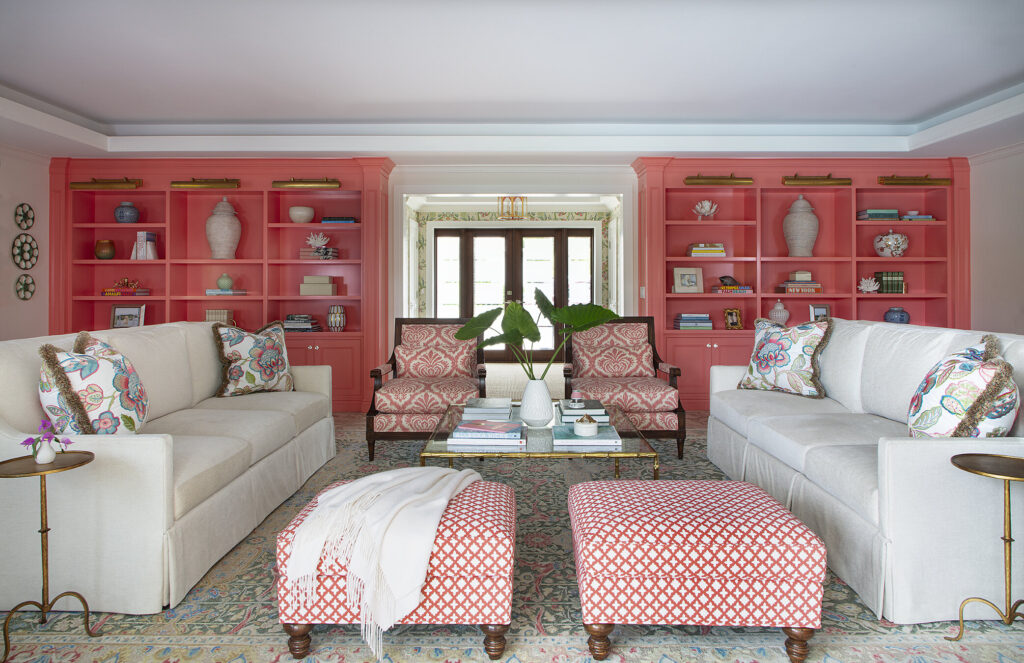
If pink is what you LOVE, Razzle Dazzle (no. 1348) by Benjamin Moore will be the best surprise in any space. I love to see it used on millwork, it’s a bit of fun, and chic when used in a traditional setting.
@erincondroninteriors
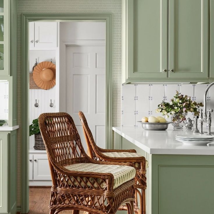
It’s no secret that I’ve been obsessed with GREEN lately… but Cooking Apple Green (no. 32) by Farrow & Ball is a classic green that will never go out of style! Unexpected color or color in general on millwork can provide a traditional style, in any space of your home.
Last but not least, my favorite color, BLUE, Denim Wash (no. cc-770) by Benjamin Moore is the finest addition to any space. Being a less saturated blue, it is easy on the eyes and a great alternative neutral too, like your favorite chambray shirt! Use it inside or outside your home to add an understated, stylish look. Check out this reel with a little color inspo & please check in now and then to see more of my favs!
Kindest regards,
— Kyleen
